Amanda Silver-Westrick, UCLA

Wednesday, June 8, 2011

Lab 8: Mapping the Fire Station in ArcGIS

This week, we explored different aspects of the 2009 Los Angeles County Station fire using ArcGIS. The Station fire, which burned over 250 square miles in Angeles National Forest, destroyed dozens of homes, and caused the deaths of two firefighters, has gone down in history as the largest fire in record in Los Angeles County (Archibold). The fire also sent a towering plume of ash and fire debris into the air over Los Angeles, which can be seen in Figure 1. My study will explore the perimeters of the fire spread between August and September of 2009. It will also analyze Debris Potential Area (DPA) zones in Los Angeles and where county hospitals are located in proximity to these zones. According to the Los Angeles County GIS Data Portal, DPA zones yield similar volumes of sediment under similar environmental conditions. These zones were measured to collect and deposit debris from the 2009 Station fire at similar rates. Higher numbers correspond with greater sediment yields.

As is shown in Figure 2, the fire was located in the center of Los Angeles County. It spread north between 2:48 a.m. on August 29th and 12:39 a.m. on September 2nd. The extent of the fire expanded both east and west, and it looks to have more than quadrupled in size throughout those four days. The fire perimeter extended over major highways and crossed major rivers.

As can be seen in Figure 3, the areas of Los Angeles County with the highest debris potential lie primarily in the northeast quadrant. The Angeles National Forest accounts for some of this area. Much research has been done since the Station fire to determine how fallen ash has affected wildlife in the area. Scientists were particularly concerned with aquatic life, since debris that falls into streams can often accumulate and harden, shredding and burying aquatic life in the process (Archibold). In addition, these zones are at a greater risk from storm damage, such as landslides and landscape destruction from water flumes (Cannon).

Fire debris can also have a devastating effect on air quality and public health. Zones with higher degrees of debris sedimentation would also logically display higher concentrations of debris in the air. Smoke is comprised of gases and fine particles that can get into human respiratory systems and aggravate the heart and the lung. Fire debris can infiltrate sinus systems and cause allergy-like symptoms. Older adults and young children are the most vulnerable to health effects from smoke in the air (Smoke Impact).

Hospital patients would be particularly vulnerable to airborne fire debris, since their bodies are not healthy enough to overcome respiratory obstacles and they often suffer from lung or heart diseases. As is shown in Figure 3, three different county hospitals lie within high DPA zones. These hospitals are Lancaster Community Hospital, Antelope Valley Hospital, and Henry Mayo Newhall Memorial Hospital. The remaining LA County hospitals were in less sediment-endangered zones in the southwest and southeast quadrants. This information would be important for area hospitals, in that they would know to transfer patients with heart or respiratory problems to hospitals in lower DPA zones. Future studies could explore county schools or endangered species, and their locations with regards to DPA zones.


"Downtown L.A. skyline." Photo taken by Don Bartelli. LA Times.
Figure 1


Station Fire Spread Between August and September
Figure 2


Debris Potential Area (DPA) and LA County Hospitals
Figure 3


Works Cited

Archibold, Randal C. "After a Devastating Fire, an Intense Study of Its Effects." The New York Times. 3 Oct. 2009. Web. 8 June 2011.

Bartelli, Don. Downtown L.A. Skyline. Photograph. PHOTOS: Southern California Wildfires. Los Angeles Times. 31 Aug. 2009. Web. 8 June 2011.

Cannon, Sue. "Debris-Flow Model." Regional Sediment Management and Water Supply Workshop. Los Angeles Department of Public Works, 14 July 2010. Web. 8 June 2011.

"Debris Potential Areas." Los Angeles County GIS Data Portal. 2011. Web. 8 June 2011.

"Smoke Impact." Sacramento Metropolitan Air Quality Management District. California Air Pollution Control Officer's Association Public Outreach Committee, 12 Sept. 2006. Web. 08 June 2011. .

Thursday, May 19, 2011

Census 2000/2010 (Lab 7)

As can be seen in the map, the highest percentages of black-alone individuals are concentrated in the southeastern United States. Counties near Georgia, Alabama, and Mississippi are colored the darkest, while the majority of the Midwest and the Pacific Northwest contain less than 1.6 percent of black alone individuals.

The Asian population, on the other hand, is largely concentrated on the Western coast of the United States. California contains most of the counties with an Asian-only population percentage of over 3.7 percent.

This map clearly shows that the Western half of the country contains the majority of other race-alone individuals. The highest percentages are also located closest to the Mexican border, suggesting that these individuals might be Hispanic. California, Arizona, New Mexico, and Texas all contain counties with over 22.2 percent of these individuals.

These census maps provide important data regarding the racial geography of the United States. This information affects fields such as public health, education, and labor policy.

DEMs in ArcGIS (Lab 6)

Standing over 4,000m above sea level, Mauna Loa is Earth's largest volcano, and is located on the island of Hawaii in the Pacific Ocean. It has erupted 33 times since 1843, making it one of the world's most active volcanoes as well. The area included in the DEM is bounded by:
Top: 19.740277777
Left: -155.86111111
Right: -155.35333333
Bottom: 19.223888888.
The geographic coordinate system is North American GCS 1983.


Sunday, May 15, 2011

Projections in ArcGIS (Lab 5)


Map projections determine how people view the world, the political and economic relationships between different countries, and the importance of certain regions on a global level. We rely on them for navigation, for international research and analysis, and for reference purposes. Since different types of projections skew different aspects of the globe, it is of critical importance that we are aware of these distortions.

Some maps skew the areas of regions across the globe, making the northern hemisphere look much larger than the southern hemisphere. These images have influenced our Western tendencies towards egocentrism, and have reinforced global efforts for Western domination. For example, in the Mercator projection, Greenland looks as though it is almost the size of Africa. In both equal area projections, however, it is clear that it is in fact much smaller. This discrepancy may inflate our perceptions of Greenland’s importance in the geopolitical scene.

Other maps distort distances. These are dangerous in the field of flight or naval navigation, since using the wrong type of map projection could send a navigator many miles away from his/her intended destination. Navigators must refer to map projections that preserve direction and distance, such as the Equidistant Conic Projection (which is useful for polar navigation) and the Equidistant Cylindrical Projection.

Mapping is a complex art, since it involves projecting 3-dimensional objects onto 2-dimensional planes. Any map projection will include distortions. By referring to multiple types of map projections and taking all distortions into consideration, we can more accurately represent the globe in plane forms.

Lab 4

Thursday, April 14, 2011

Lab 3: Neogeography


View Puerto Rico adventure in a larger map

Neogeography allows people to share mapping information and spatial experiences in an interactive setting. It exponentially increases the mapping of the Earth's surface, and it introduces mapping in new and innovative ways. Neogeography improves our ability to communicate spatial concepts to others, and it places the field of mapping in the hands of everyday people. These advances have paved the way for anyone with an Internet connection to create a map of their very own, no degree in cartography required.

However, neogeography also introduces new risks to the field of mapping. Since it is available to anyone with an Internet connection, there is a definite lack of accountability. There are no guarantees that these produced maps are accurate or reliable. Furthermore, these maps are now flooding the interweb. It can be highly difficult to determine the validity of maps found through search engines. Neogeography can also be more difficult than expected, since the user is confined by the boundaries of the program that he or she is using. For example, in Google Maps, there are only so many shapes that one can superimpose onto the map. This limits the user's ability to turn the map into something new and innovative.

Lab 2

1. What is the name of the quadrangle?
- Beverly Hills Quadrangle

2. What are the names of the adjacent quadrangles?
- Canoga Park (NW), Van Nuys (N), Burbank (NE), Topanga (W), Hollywood (E), Venice (S), Inglewood (SE)

3. When was the quadrangle first created?
- 1966

4. What datum was used to create your map?
- North American Datum of 1927 (horizontal), North American Datum of 1929 (vertical)

5. What is the scale of the map?
- 1: 24,000

6. At the above scale, answer the following:
a) 5 centimeters on the map is equivalent to how many meters on the ground?
- 1,200 meters
b) 5 inches on the map is equivalent to how many miles on the ground?
- 1.89 miles
c) one mile on the ground is equivalent to how many inches on the map?
- 2.64 inches
d) three kilometers on the ground is equivalent to how many centimeters on the map?
- 12.5 centimeters

7. What is the contour interval on your map?
- 20 feet

8. What are the approximate geographic coordinates in both degrees/minutes/seconds and decimal degrees of:
a) the Public Affairs Building;
- 118̊ 26’18” OR 118.438̊
b) the tip of Santa Monica pier;
- 118̊ 30’ OR 118.5̊
c) the Upper Franklin Canyon Reservoir;
- 118 degrees 24’43” OR 118.41 degrees

9. What is the approximate elevation in both feet and meters of:
a) Greystone Mansion (in Greystone Park);
- 570 ft, or 173.74 meters
b) Woodlawn Cemetery;
- 140 feet, or 42.67 meters
c) Crestwood Hills Park;
- 600 ft, or 182.88 meters

10. What is the UTM zone of the map?
- Zone 11

11. What are the UTM coordinates for the lower left corner of your map?
- 3,763,000m northing by 361,500m easting

12. How many square meters are contained within each cell (square) of the UTM gridlines?
- 1 sq km

13. Obtain elevation measurements, from west to east along the UTM northing 3771000, where the eastings of the UTM grid intersect the northing. Create an elevation profile using these measurements in Excel (hint: create a line chart). Figure out how to label the elevation values to the two measurements on campus. Insert your elevation profile as a graphic in your blog.


14. What is the magnetic declination of the map?
- positive 14̊

15. In which direction does water flow in the intermittent stream between the 405 freeway and Stone Canyon Reservoir?
- southward

16. Crop out (i.e., cut and paste) UCLA from the map and include it as a graphic on your blog.

Thursday, March 31, 2011

Lab 1

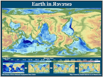
1. The map below is a map of the surface of the Earth in reverse, in which south is pointing up, west is pointing right, traditionally tan-colored land areas are depicted in shades of blue, and oceans are depicted in shades of green and brown. I discovered it on a blog called "Map of the Week" on blogspot. The blog can be located at http://mapoftheweek.blogspot.com/.


I found this map interesting because it challenges my conventional notions about how geographic maps should appear. Even though the land forms are clearly outlined and elevation is meticulously explained in the key, the color and directional changes have made the map relatively unrecognizable to me upon first glance. It takes my eyes several seconds to focus on the familiar shapes of South America and Africa. Since the tallest mountain ranges are depicted as the darkest blues, they appear as the deepest parts of the ocean would appear in standard maps. The reverse map speaks to the importance of maintaining a universal standard for mapping, in order to ensure that people from different regions and languages can work with common materials. It also highlights the fact that a huge majority of the Earth's surface is covered by water. In the reverse map, greens and browns dominate the field.

2. The next map shows the growth of scientific research between 1990 and 2001, depicted by the size of each country on the map. Scientific reserach is measured by scientific publications released per person. I stumbled across the map on a blog called "Beerkens' Blog: Higher Education, Science & Innovation From a Global Perspective" at http://blog.beerkens.info/index.php/2007/01/the-world-according-to-maps/.

The above map challenges my notions of the developed world and its hierarchy of technological innovation. Despite the economic and military dominance of the United States, for example, our recent scientific growth is markedly unimpressive. Europe, on the other hand, where nationalized education systems abound, looks positively bloated with scientific innovation. On the other end of the spectrum, regions such as Africa and Indonesia are barely existent. The map clearly illustrates the scientific dominance of the northern hemisphere, particularly Europe and Asia. In addition, the mapping style seems particularly effective for the conveyed message. Rather than simply displaying countries with different colors and providing a key for reference, the creator skewed the sizes of regions themselves in relation to their scientific growth. Larger countries appear dominant, intruding on the spheres of surrounding countries, which diminish in their presence. The mental images are not lost in the overall tone. The map offers an interesting take on development levels throughout the world, and suggests a slightly different hierarchical order that one might otherwise imagine.

3. The third map illustrates connections between Facebook friends across the world. Each line on the map represents a friendship on Facebook. I found the map at http://www.digitaltrends.com/computing/check-out-this-stunning-facebook-world-map/.

In the map above, the brightest countries, such as the U.S. and those in Europe, show the areas with the largest number of Facebook connections. I find it absolutely fascinating, when looking at the map, that these connections were not juxtaposed onto a basic map of the world. Instead, the connections themselves have created highly accurate outlines around continents, where coastal Facebook users have online friendships. To me, the map signifies a number of important truths about our contemporary global community. It speaks to the increased globalization of our societies as well as the growing global popularity of Facebook. It is a timely and eerie depiction of the power and reach of modern social media tools.