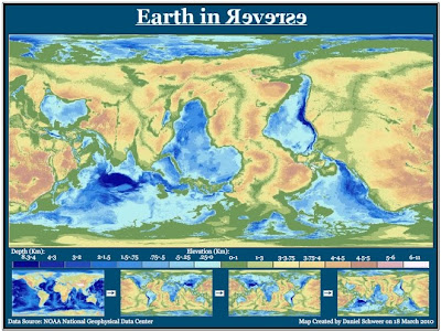
I found this map interesting because it challenges my conventional notions about how geographic maps should appear. Even though the land forms are clearly outlined and elevation is meticulously explained in the key, the color and directional changes have made the map relatively unrecognizable to me upon first glance. It takes my eyes several seconds to focus on the familiar shapes of South America and Africa. Since the tallest mountain ranges are depicted as the darkest blues, they appear as the deepest parts of the ocean would appear in standard maps. The reverse map speaks to the importance of maintaining a universal standard for mapping, in order to ensure that people from different regions and languages can work with common materials. It also highlights the fact that a huge majority of the Earth's surface is covered by water. In the reverse map, greens and browns dominate the field.
2. The next map shows the growth of scientific research between 1990 and 2001, depicted by the size of each country on the map. Scientific reserach is measured by scientific publications released per person. I stumbled across the map on a blog called "Beerkens' Blog: Higher Education, Science & Innovation From a Global Perspective" at http://blog.beerkens.info/index.php/2007/01/the-world-according-to-maps/.

The above map challenges my notions of the developed world and its hierarchy of technological innovation. Despite the economic and military dominance of the United States, for example, our recent scientific growth is markedly unimpressive. Europe, on the other hand, where nationalized education systems abound, looks positively bloated with scientific innovation. On the other end of the spectrum, regions such as Africa and Indonesia are barely existent. The map clearly illustrates the scientific dominance of the northern hemisphere, particularly Europe and Asia. In addition, the mapping style seems particularly effective for the conveyed message. Rather than simply displaying countries with different colors and providing a key for reference, the creator skewed the sizes of regions themselves in relation to their scientific growth. Larger countries appear dominant, intruding on the spheres of surrounding countries, which diminish in their presence. The mental images are not lost in the overall tone. The map offers an interesting take on development levels throughout the world, and suggests a slightly different hierarchical order that one might otherwise imagine.
3. The third map illustrates connections between Facebook friends across the world. Each line on the map represents a friendship on Facebook. I found the map at http://www.digitaltrends.com/computing/check-out-this-stunning-facebook-world-map/.

In the map above, the brightest countries, such as the U.S. and those in Europe, show the areas with the largest number of Facebook connections. I find it absolutely fascinating, when looking at the map, that these connections were not juxtaposed onto a basic map of the world. Instead, the connections themselves have created highly accurate outlines around continents, where coastal Facebook users have online friendships. To me, the map signifies a number of important truths about our contemporary global community. It speaks to the increased globalization of our societies as well as the growing global popularity of Facebook. It is a timely and eerie depiction of the power and reach of modern social media tools.